

ร้านค้าออนไลน์
การจอง
อีเวนท์
ป๊อป-อัพ

Mobile Menu Navigation Bar
โดย
Sticky mobile menu and bottom navigation bar
ยังไม่มีรีวิว
มีแพ็กเกจใช้งานฟรี

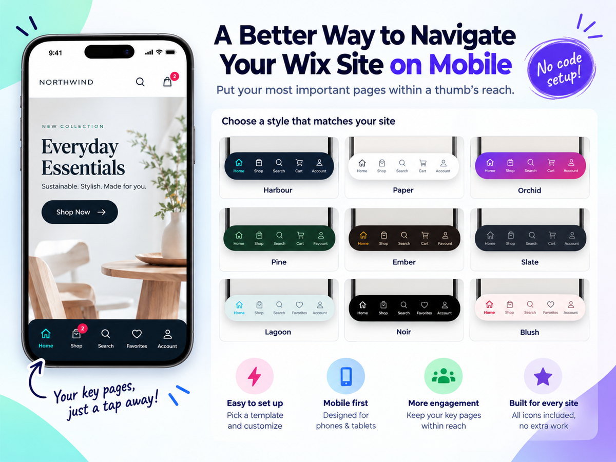
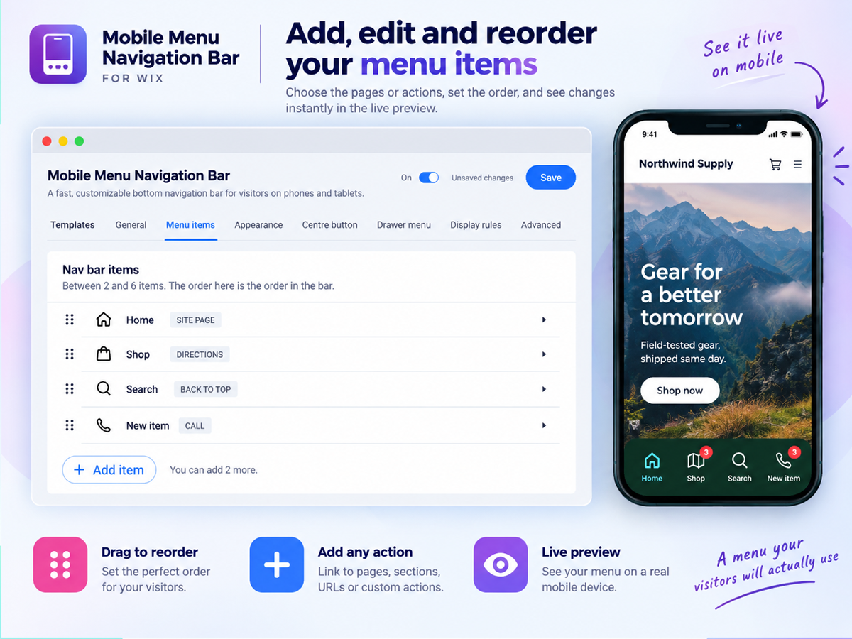
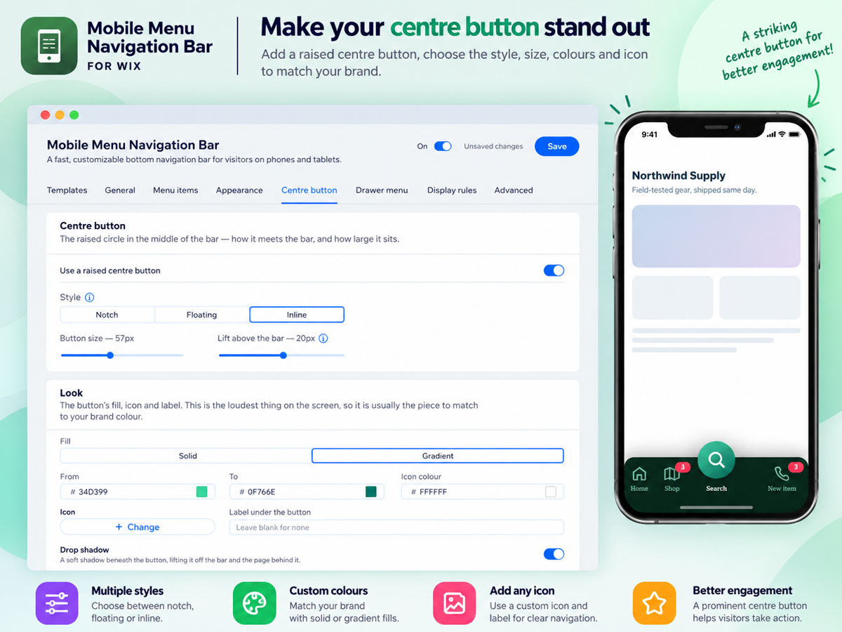
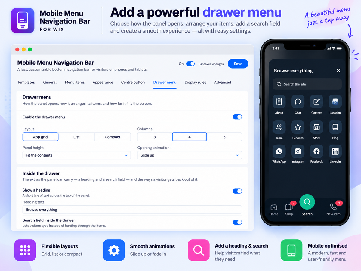
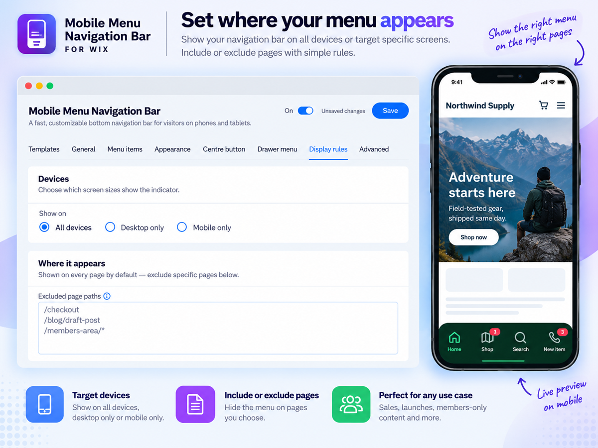
ภาพรวม Mobile Menu Navigation Bar
- Bottom navigation bar your visitors already know how to use: Add a sticky mobile menu bar fixed to the bottom of the screen, exactly like the apps on every phone. Choose 2 to 6 buttons for Home, Shop, Search, Cart, Account or anything else, and your most important pages stay one tap away instead of hiding behind a hamburger menu nobody opens
- Buttons that do more than link: Every button can open a page or URL, run a site search, jump to the cart with a live item count badge, log a member in, start a WhatsApp chat, place a phone call, send an email or SMS, open directions, share the current page, scroll to a section, or scroll back to the top
- A design that matches your brand, not a preset: Start from 12 ready-made looks, then make it yours: classic, floating or dock bar styles, solid, gradient or frosted glass backgrounds, 99 built-in icons across 10 categories or your own uploads, seven active indicators, custom colours, labels, sizes and corner radius, all with a live preview beside the settings
- A centre button and a full menu drawer: Raise a standout centre button above the bar and let it open a slide-up drawer holding up to 24 more links in a grid, list or compact layout, with its own search field, so your whole site stays reachable without ever crowding the bar
ให้คะแนน & รีวิว
ยังไม่มีการรีวิวแอปนี้ คุณสามารถเริ่มต้นให้คะแนนเป็นคนแรกราคาและแพ็กเกจ
แพ็กเกจ Basic
ฟรี
4 styles and 99 built-in icons
3 item selections & color selections
Navigation actions & Reset to defaults
Labels and destinations options
แพ็กเกจ Premium
$
6
99
/เดือน
Contact, conversion actions with badge
Floating and dock styles
12 styles & gradient, glass background
Centre button & Drawer menu access
* ราคาในสกุลเงิน USD